
Python Plot Library for Data Analysts
An introduction to a plot library based on Plotly which is mainly targeted data analyst creating analyses using Python and showcasing them in slide decks.

I’ve come to love the Plotly library in Python. It is very powerful and super versatile. I do from time to time write quite a lot of code to make the plots I want to present.
I’ve therefore started to make an extension of the Plotly library to make it easier for data analysts to plot beautiful charts while enabling story telling through callouts. The extension is called plotly_presentation. It should be simple to alter the default template, and given an organisation will adapt the library, then the defaults can be stored centrally and applied locally.
Plotly 1.0.1
I most often use the plotly.express functions as it is a super easy way to get starting with the plots. This is also baked into the plotly_presentation library, as an easy way of getting started.
import plotly.express as px
fig = px.bar(x=[1,2,3], y=[1,2,3])
fig.show()
Hereafter it is possible to alter the layout and adjust the figure using plotly, e.g.:
fig.update_layout(...)
fig.add_annotation(...)
At some point you’ll end up with exactly the plot you wish for.
This is a fairly simple syntax, though it takes some time to get used to. I’ve therefore tried to mimic as much as possible from the plotly library while taking a bunch of inspiration from the Spotify Chartify library build for Bokeh.
plotly_presentation
The same plot as above is created using the plotly_presentation:
from plotly_presentation import Plotter
p = Plotter()
p.express(type="bar", x=[1,2,3], y=[1,2,3])
p.show()
If needed then it is also possible to access the figure and adjust the layout and add annotation using the below commands.
p.figure.update_layout(...)
p.figure.add_annotation(...)
Callouts
But the above just adds a few more lines of code to do the same. But the real value comes when starting working with callouts. These are combinations of annotations making it easier to highlight the important parts of the chart, and hence ease the communication of the story.
p.callout.add_square_growth_line(
    x0=1,
    x1=3,
    y0=1.1,
    y1=3.1,
    y_top=3.5,
    text="+2"
)
p.show()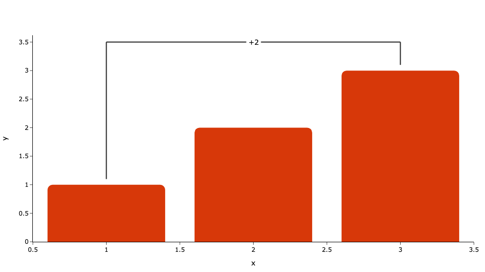
Next steps
The library is still a work in progress, and more types of callouts will be added to further ease the story telling.
If you have good ideas or beautiful plots, then please add an issue on the repo.
Love it! Kind of what Think-Cell is for PowerPoint. I would love to help with doing an implementation in Altair.